The Importance of Copyediting and Proofreading
February 27, 2024

Visualizing Government Financial Data Quickly and Easily with Microsoft Power BI
Thanks to tools like Power BI, it’s now easier than ever to ingest, analyze, and visualize data. In the following tutorial I’ll be showing you how to you can use government data to quickly learn more about the Commonwealth of Virginia’s expenditures and revenues. We’ll be learning how to import financial data, visualize that data on a series of graphs, and explore the data with Power BI’s powerful built-in tools. With just a few straightforward steps, you’ll be able to explore all of Virginia’s revenues and expenditures for FY2016 from the highest level down to individual state agency programs and funds.
Over the past few years many governments and public organizations have committed to more transparency by providing data about activities and finances. Making sense of all of this data doesn’t have to be difficult. Tools like Microsoft Power BI offer straightforward ways to ingest data and provide quick insights with the familiarity of a Microsoft Office-like interface.
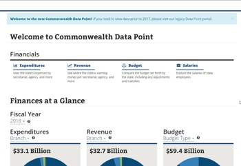
In this case, I’m going to explore government expenditure and revenue data from the Commonwealth of Virginia. This data set is provided as a service from the Commonwealth’s Data Point portal. I’ve chosen to focus on historical data covering FY2016, which runs from July 2015 through June 2016. This data is well-structured and provides descriptive resources to track expenditures and revenues by agency, fund, and program.
The data describes the state’s financial inflows and outflows, but could easily represent your own personal or business financial data. After this tutorial, one could easily build a dashboard to monitor historical financial status or even to forecast future financial performance.
This data is from a historical archive, while more recent data is housed in another section of the Data Point portal that includes some on-age analysis and charts, but it can also be exported and analyzed in external tools.
For this exercise I’ll be downloading the following files:
- FY2016 Expenditures: http://legacydatapoint.apa.virginia.gov/downloads/expenditure/2016%20EXP.zip
- FY 2016 Revenues: http://legacydatapoint.apa.virginia.gov/downloads/revenue/FY16.zip
- Data crosswalk: http://legacydatapoint.apa.virginia.gov/downloads/Data%20Crosswalk.zip
The expenditures data outlines the agency, the vendor that was paid, the amount of the transaction, and the date of transaction. Revenue data includes the agency, the amount that was received, the fund name and program name. The Data Crosswalk provides data that helps relate numeric codes in the expenditure and revenue data to the actual agency, fund, and program names.
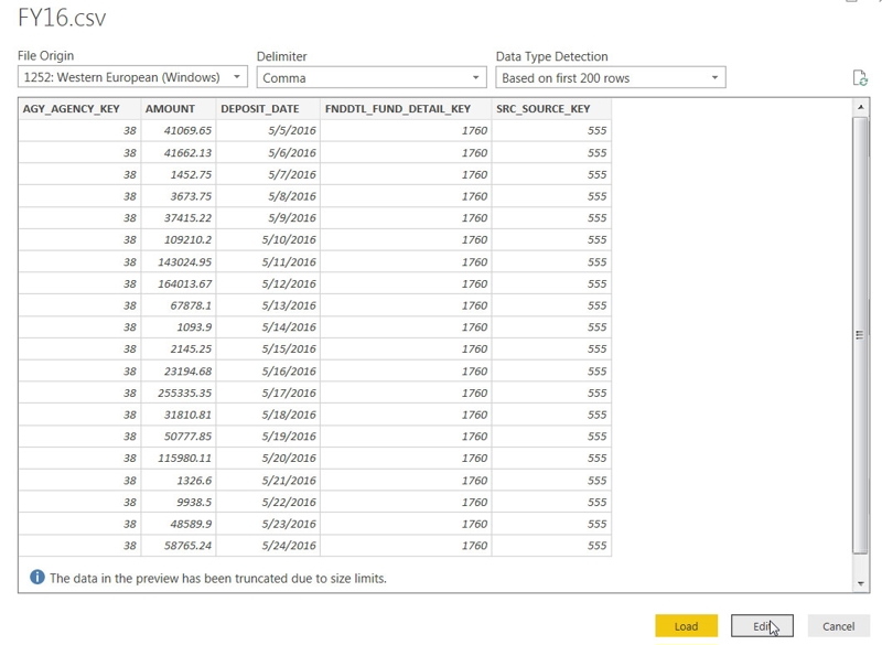
After downloading the files above, extract their contents to a location you have easy access to. You’ll find that the expenditure data includes a CSV file for each quarter of fiscal year 2016 and is much larger in volume than the revenue data.
The data crosswalk file includes several Excel spreadsheets but for this exercise we only care about the first tab of each.
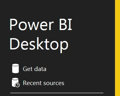
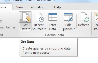
We’ll get started by launching Power BI and clicking the “Get Data” button on the home screen.
Part 1: Importing Expenditure Data
First let’s import the data for expenditures:
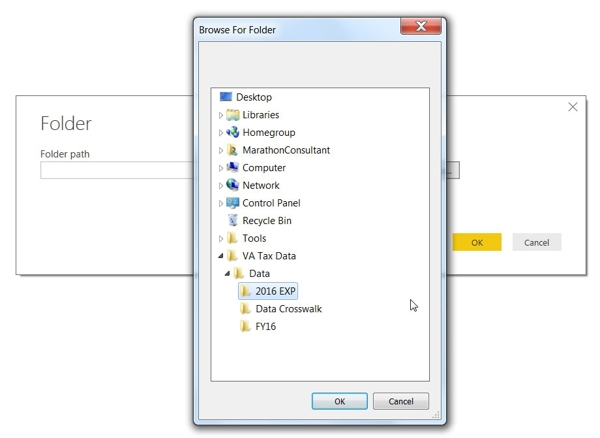
- Select “Folder” on the list of data sources. This will import all files for a given folder, and in this case, I have extracted all of the expenditure data to its own folder.

- Click the “Connect” button
- Click “Browser”, then locate the folder where you extracted the expenditure data files and click OK
- Click “Combine & Load”
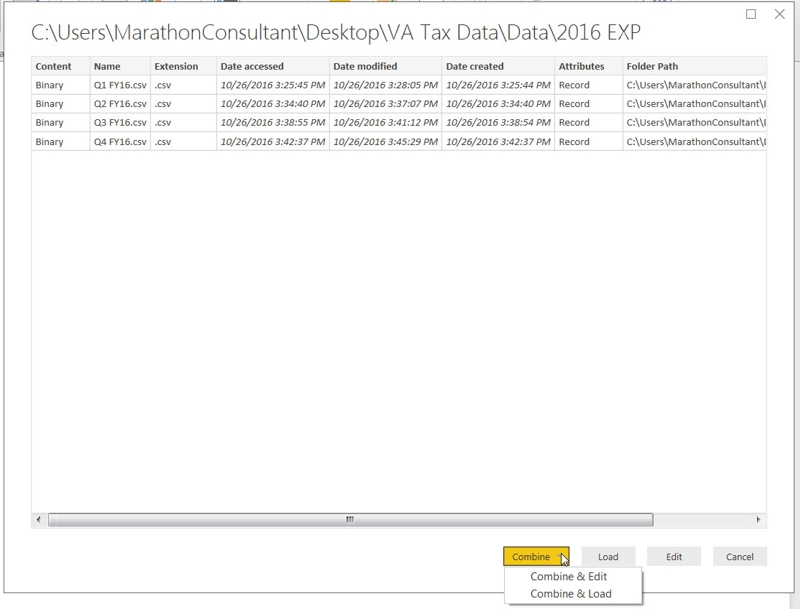
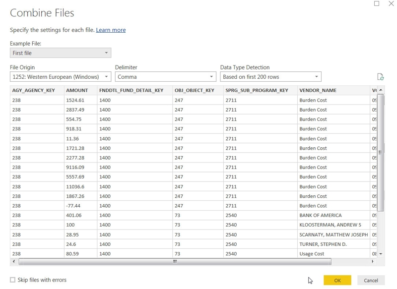
- Click OK in the “Combine Files” window
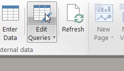
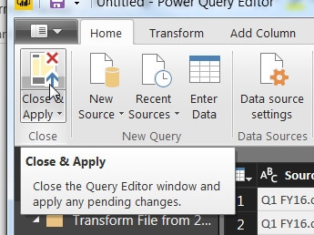
- Now click on the ‘edit queries’ button. We are going to change the “Amount” column from a standard numerical data format to the fixed decimal format used for currency.
- Click on the ‘1.2’ button in the top left of the “Amount” column to bring up the format selection
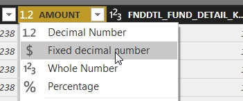
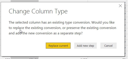
- Choose to replace current to override the current format selection
- Click “close & apply” to save the changes
- This should return you to the main Power BI Report view
We just successfully imported the entire FY2016 expenditure data for all agencies throughout the state. We selected the files where our data was stored, slightly altered the data format, and applied our changed. Importing and formatting data is the most important step of any data analysis endeavor. Clean, well-structured data makes analysis much easier!
Part 2: Import Revenue Data
Now let’s import the data for revenues:
- Click the “Get Data” button
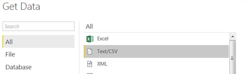
- Click the “Text\csv” item
- Click connect
- Navigate to the location where you extracted the revenue data. Select it and click “Open”
- Click “Edit” – we are going to change the “Amount” column format from regular decimal to the Standard Decimal to the Fixed Decimal format for displaying currency values.
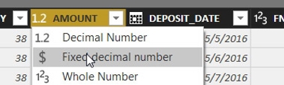
- Click “Replace current” to change the current column type
- Click close & apply
- You are once again returned to the main report view
Now we have both expenditure and revenue data imported into our Power BI model.
Part 3: Creating Data Relationships with the Data Crosswalk Files
The final step of the data import involves the Data Crosswalk files. These will help to describe the data that was imported in the two exercises previously completed. In this exercise you’ll see how Power BI automatically attempts to create mappings between related data across all of the imported sources.
Let’s get started:
- Click “Get Data”
- Select “Excel” from the data sources list and click “Connect”
- Click “Load” to select one of the files from the location where you saved the data crosswalk files
- Select “Agency Code Crosswalk”
- Click the checkbox to import only the “Export Worksheet” tab of the spreadsheet
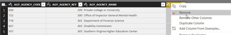
- If you scroll to the right in the preview section, you’ll see that Power BI detected an extra column. We are going to click the “edit” button to remove this before completing the import.
- In the window that appears, right click on the last column header to the right and select the “remove”.
- Click “Close and Apply”
- You will be returned to the main report view
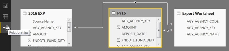
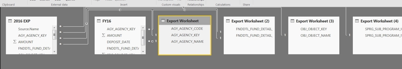
- Click on the relationships view and you’ll see that Power BI detected a relationship between the agency key column in the revenue and expenditure data to the agency key column of the agency data we just imported. Power BI automatically found the relationship because the two data sources share the same column names. This allows us to retrieve an agency name from the data crosswalk file based on the agency key column in the expenditures/revenue.
- Repeat the above steps until you have imported all of the Excel files included in the Data Crosswalk files. You do not need import the “Source Code Crosswalk”, so you may skip that file for this demonstration.
- When the four crosswalk files are imported successfully it should appear something like this:
- For clarity, we are going to rename the data sources for the data crosswalk. By default it assumes the name of the worksheet it was imported from, so we have several named “External Worksheet” and that’s not very descriptive.
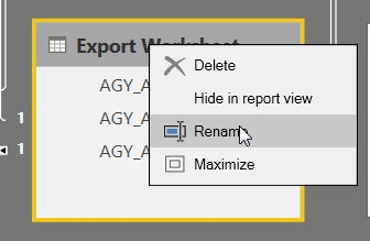
- Right Click on the header of each of the crosswalk data sources and click “Rename”. Rename it from “External Worksheet” to something that makes sense based on the data. For example: “Agencies”,” Sub-Programs”, etc.
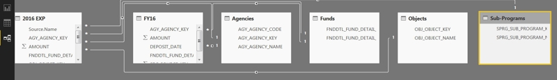
- Once everything is cleaned up it should look something like this:
Now we have all of our data imported, our relationships defined, and all ready for consuming. This is the hardest part of any data analysis endeavor.
Part 4: Visualizing the Data
Let’s make a few charts so we can see what the data can tell us about how Virginia allocated money for expenses. Let’s return to the “Report” view and see what we can come up with.

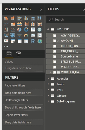
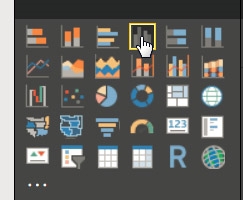
The report view offers a lot of functionality to visualize your data. You’ll see that everything you imported is available in the “Fields” section, and there are charts and graphs of various types in the “Visualizations” section.
Visualize the Expenditures:
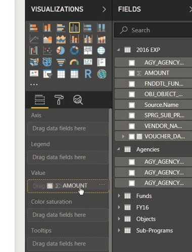
- Click on the clustered column chart. This will insert a blank chart into your report.
- Now drag the “Amount” column to the “Values” section of the chart properties. The chart should update.
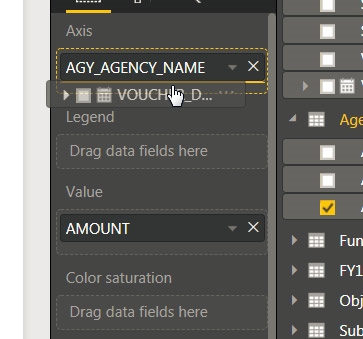
- Then locate the Agency data from the data crosswalk – drag the “AGY_AGENCY_NAME” to the Axis property. The chart will once again update and now display a bar for each agency, where the value of the bar is based on the sum of all expenditures for that agency.
- Now find the “Voucher date” column from the expenditures data to the “Axis” property and place it under the “AGY_AGENCY_NAME”
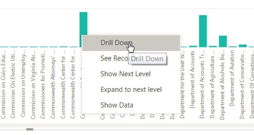
- This will update the chart once again so you can drill down into the data to see each agency’s expenditure by year, quarter, month, and day.
- You can drill down into any agency’s expenditures by right clicking on any column and selecting “Drill Down”. You can continue to do this for drill-down until you reach the lowest date filtering, which is “Day”.
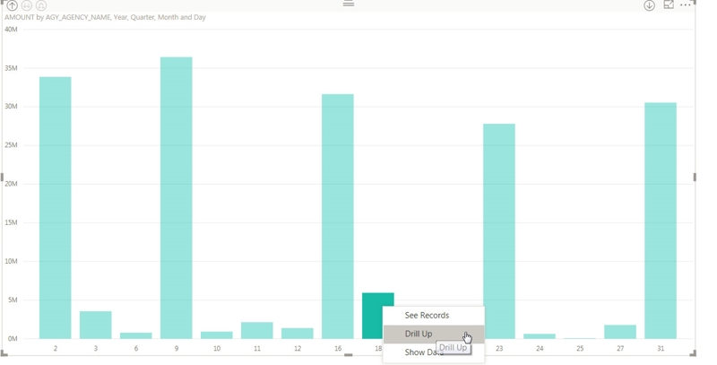
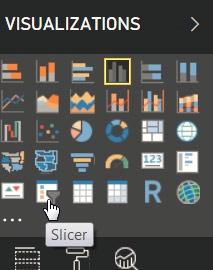
- You can optionally play with the “slicer” control to add a familiar form-like interface to drill down without needing to right click on each bar.
- In this example, I have added a slicer that allows you to filter on everything provided by the data crosswalk, and also filter based on date ranges. Additionally, I have added additional columns that can be drilled down, so you can drill into an agency’s data and then see how each fund or program was allocated within it.
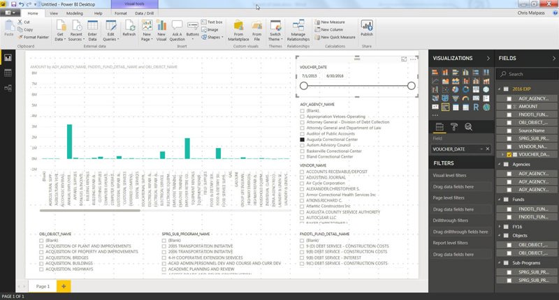
We just created a nice, easy to explore dashboard so that we can dive into the expenditure data. The slicer visualization allows us to filter the data on a wide range of categories, which allows us to see very broad data in the bar chart or to see very specific data, even down to individual agency programs and days of the year.
Wow – that’s a lot to process. Try and apply the same concepts on your own to produce this report for the revenue data:
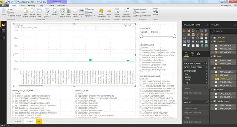
This page of the dashboard uses the same concepts as we utilized for the expenditure data, but just to show incoming transactions instead of outgoing.
Want to take it a step further?
Using what you just learned you can create your own report that visualizes the revenue and expenditure together on a single chart! Further experimentation could include a report to find the highest paid vendor for each state agency or even to find the day of the year with highest revenues.
This is just a quick overview of one of the many ways to can analyze publicly available data using Power BI. I invite you to experiment and find your own insights about this data set or use your own!

Chris MalpassCore Contributor
Chris Malpass is a seasoned software developer and data geek native to Hampton Roads, Virginia. As a Marathon Consultant Chris prides himself on learning and applying new skills quickly. A veteran of the open-source world, Chris is now heavily focused on building solutions based on the .NET framework and Microsoft products. When Chris isn’t helping our clients solve complex problems, he’s likely traveling with his family, reading, or exploring the region with one of his many vintage cameras.