
The Importance of Copyediting and Proofreading
February 27, 2024

Improving the User Experience of Mailto: Links
Communication, like so many other areas of our modern-day lives, has been redefined time and time again, with increasing velocity, by the ubiquitous presence of that catch-all phrase we call “technology”. Where once we sent messages through the sky on slips of paper tied to the feet of birds, we now do the same via invisible beams of information that bounce off satellites. All but gone are the days of physical “snail-mail”, whose last gasps of relevance have been relegated to piles of impersonal, undesired piles of credit card applications, mixed in with the occasional invitation to a wedding and/or child’s birthday party. Email, a term so pervasive that it now appears in the Oxford Dictionary with only the slightest mention of its long-hand origin, has become the accepted means of business communication today. However, although the fundamentals of email have remained uncommonly consistent since the 1980s (go here for a thorough explanation of how email works), the method with which the end-user interacts with email has changed in recent years.
As the Internet and mobile devices have achieved near universal adoption among business professionals in the developed world, email clients have likewise moved from local applications on a single-endpoint device (think older versions of Microsoft Outlook) to “webmail” clients that can be accessed anywhere with an Internet connection (think Gmail). This shift to a cloud-based email storage system is a significant advantage for business professionals, since it enables them to have access to the same stream of communication whether they are at their desks, at a client site, or on the golf course. And as web developers, our responsibility must be to facilitate this approach to communication as intuitively as possible.
In 1998, “mailto” was introduced as a URI scheme for email addresses in HTML, which allows users to click on a hyperlink contained in a web page in order to send an email without first having to copy & paste the email address into a web client. This is useful if the content of the email is static boilerplate, however problems arise if a user needs to write a custom message prior to sending. The solution to this problem was to open a new message in the user’s email client with the recipient and subject fields pre-populated so that the user could then complete the email’s content prior to sending. This solution was perfect in 1998. However, in 2018, this causes serious user experience (UX) problems, given that a large portion of a site’s user-base now uses web-based email.
The most common reaction of users who prefer to use webmail will typically be one of minor nuisance, since they will be forced to copy & paste the email address into their webmail client of choice, effectively negating the original purpose of using mailto. However, in more extreme albeit less frequent cases, there will be some users who have neglected to set up a default local email client on their personal computers. In these cases, the effective result will be a hyperlink on the web page that will appear to do nothing at all when clicked. Furthermore, there is no way for a website to detect if any given user has a default email client set up on their local machine. Therefore, in these cases the use of mailto links should be considered a technical bug and must be treated as such.
So the question now becomes: how do we debug this issue of mailto links? Clearly mailto has benefits for users who still prefer to utilize a local email client, so a complete dismissal of mailto would be inappropriate at this time. We could simply copy the email address in question to the user’s clipboard and call it a day, but perhaps we can do better. With regards to UX, Marathon contends that giving the end-user flexibility and options when developing software has more value than forcing a single particular solution. With this in mind, we recently implemented the solution seen in Figure 1 for one of our clients to solve this issue (credit should be given to this blog article for providing a template for the solution).
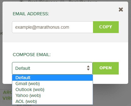
Figure 1: Mailto Popup Modal Solution
The popup modal in Figure 1 appears as an overlay when the user clicks on what was formerly a mailto link on the page, which still retains the appearance of a hyperlink. The modal is divided into two sections. The bottom section contains a dropdown of hyperlinks that direct to the most common webmail clients used today. The “default” option in this list is the classic mailto link, so that users who prefer to use their local email client, or who are not familiar with the other options, can do so. The top section of this modal contains the recipient’s email address in a read-only text field with a button that will copy the address to their clipboard. The expected user-flow is that a user will click on what appears to be a mailto link on the page, which will then open a popup dialog. The user is then presented an option to open their desired webmail client and use the “copy” button to easily copy the email address into the email’s recipient field (making the assumption that “copy & paste” is a familiar enough operation for most users). They can of course copy the email address to a different web client if their preferred client is not listed. This ensures that the same result will occur for all users who click on the original link, regardless of whether or not they have a local email client established.
The original purpose of mailto links was to avoid the use of copy & paste. However, that purpose implies a limitation of user options that should, as a rule of thumb, be avoided. And in this particular case, that limitation actually creates a serious UX bug for some, which may not be obvious to the developer. The lesson to be learned here is that when developing web solutions that have a potentially large audience, care should be taken to ensure that the experience of any general-purpose website be the same for all users, regardless of their specific settings or technical savvy.

Erin is a UX Architect and Team Lead at Marathon Consulting. Her background is in photography, travel, marketing, art, and engineering. Erin is responsible for all aspects of User Experience from user data analysis and testing, creation of personas, user journeys and information architecture, to wireframing, prototyping and design. She also works closely with developers to ensure all final deliverables are in line with the overall vision of the project. Erin is passionate about creating the best user experience possible for each web or application project, learning new methodologies to improve the UX processes on her team, and sharing her knowledge with others. In her free time she enjoys playing online RPGs, macro photography, and landscaping.