The Importance of Copyediting and Proofreading
February 27, 2024

5 Easy Ways to Improve the Accessibility of Your Website
Websites have become a staple in everyday life. People throughout the world use websites and applications on a daily basis to do anything from ordering lifesaving medicine to leaving a review of a local restaurant. We use the web for banking, shopping, research, collaboration, social engagement, booking travel, keeping in touch, sharing, and so much more. For a business, having a website is essential to provide customers, clients, and other audiences a way to access and learn what the company has to offer.
Since people rely on the internet for many of their daily activities, it can be a source of frustration when websites don't work as expected. From broken links, missing or hard-to-find content, to illegible text and buttons that lead nowhere, users may express their frustration with a swift exit from the offending website.
These frustrations are more apparent - and prevalent - for users with disabilities.
When web accessibility takes a backseat, an integral part of a company's audience is being excluded. Not only is this bad design, but can cause a business to lose revenue, to be subject to lawsuits, and increase the frustration of visitors to your site.
Imagine the website visitors that are hard of hearing; they would not be able to understand video content without closed captioning or transcripts. Users that have visual impairments may not perceive certain colors or be able to read low contrast text. Users with limited mobility may struggle to fill out an important form or click a call-to-action button without a mouse. Recognizing these short comings in user experience and adjusting the design and functionality to accommodate the needs of all users will allow your website to reach the entirety of your audience and give everyone a delightful user experience. This makes for happy visitors, and happy visitors are often returning visitors.
Legality of Web Accessibility
In the same way a business can be sued for not having a wheelchair ramp, it can be vulnerable to lawsuits for not having an accessible website.
When the Americans with Disabilities Act (ADA) was first created, websites did not play such a dominant role in day to day life as they do now. As websites grew increasingly vital to everyday life, web compliance laws were created, dictating that the web must be as accessible as any other business in the brick and mortar world.
The law requires web accessibility. Section 508 of the Rehabilitation Act created one of the largest adjustments to Web Accessibility.This dictated that all federal websites must be accessible to users with disabilities. Therefore, most government websites follow the AAA compliance standard described below.
The legislation that affects most websites however, would be Title III of the Americans with Disabilities Act. Instead of ADA compliance for federal websites, this legislation demands that all websites offer an equal experience for those with disabilities.
Since the legislation only dictates an equal experience, a voluntary group called the World Wide Web Consortium (W3C) has created a list of recommendations for meeting these guidelines and the result of their hard work has created the standard for ADA compliance.
The Levels of ADA Compliance
There are three levels of ADA compliance labeled "A", "AA", and "AAA". It is suggested that most websites aim to meet the "AA" level of compliance as this is considered to be the "Goldilocks" level. Here is a breakdown of what each level requires:
"A" Compliance: This level of compliance has the most flexibility, the loosest rules, and is the easiest to meet. It covers basic ADA compliance items such as adding ALT (alternate) tags to images (providing text alternatives for non-text content). Other examples include ensuring the user can navigate the website using only a keyboard, and that the website has clear, helpful page titles. It is not typically recommended that websites meet only this level due to the vulnerability of a lawsuit or inaccessibility by some users. This compliance level ignores contrast ratios and other criteria for a truly accessible website.
"AA" Compliance: This is the standard most often recommended for an acceptable level of compliance. If a website meets this level, it is typically accessible for everyone and demonstrates good user experience. Among other enhanced features, this compliance level accounts for a higher contrast ratio between foreground and background, consistent navigation, and captions on videos.
"AAA" Compliance: The highest standard a website can follow. Due to the strict requirements of this level, it is generally not recommended that average websites strive to conform to this standard. The "AAA" level of ADA compliance would include sign language for videos and contrast ratios as high as 7:1 for standard text. Most government websites and institutions such as banks are recommended to follow this level of compliance.
For a quick overview of ADA requirements visit the WCAG Quick Reference Sheet.
5 Simple Ways to Improve Web Accessibility
So how do you get started? Know that it is far easier to design for accessibility first, than it is to go back and to make an existing website accessible, but it is not a monumental task. If you already have a website, here are 5 easy ways to improve your website's accessibility.
1. Add ALT tags to images. Users who are visually impaired cannot see the images on a page. This audience may use software called screen readers to tell them what images are on a website. That is what ALT tags provide - the description of the image. If ALT tags are absent or not descriptive, then users have to guess what should be there when the screen reader reaches the image. They may not get the full experience intended by that content. To improve accessibility, do not just add ALT tags - add descriptive ALT tags that take the guesswork out of the image.

 For the image example above, an appropriate ALT tag would be: “Black keyboard with blue backlit keys” The ALT description does not have to be a novella of description. It must inform the user what is there and how it relates to the rest of the content.
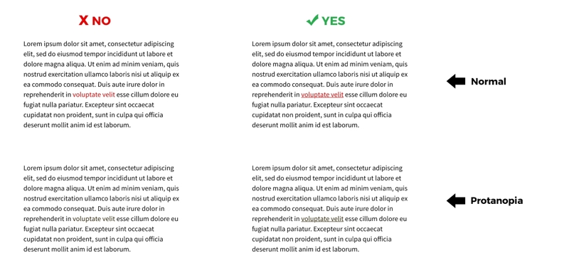
2. Ensure Links are Distinguished by More Than Just Color. Distinguishing links by more than just color is essential to navigating websites and meeting accessibility guidelines at the lowest level. These links aid in internal site navigation, leading users on a path to related content, and act as calls-to-action. This could mean adding an underline or turning the link into a button. If a link is only a different color, users with certain types of color blindness will only see text.
For example, a text link in red would stand out fairly well to a user with normal vision, but to a user with color-blindness (Protanopia in this example) the link disappears. Adding an underline will allow all users with color blindness to easily identify a link.

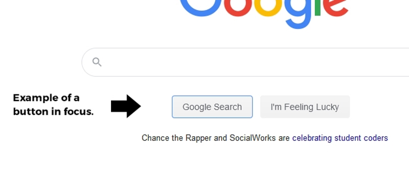
3. Make Web Pages Keyboard Accessible. The computer mouse has long been an accessory to the desktop, but to users who may have shaking hands, arthritis, or have limited mobility cannot rely on it. Instead, it is easier to navigate through a website using the keyboard. Add focus indicators to the content so the user can tab throughout the site. It’s beneficial to also add a ‘skip navigation’ link so the user does not have to tab through the same set of links on every page. Also add styles when HTML items are active or focused on. A good example would include when a user tabs to a form, the field they tabbed to either has a border change or a significant change of background color.

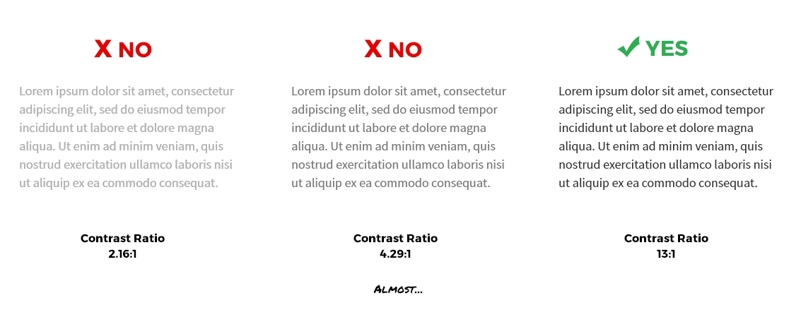
4. Follow Color Contrast Requirements. The WCAG’s standard for color contrast would be a ratio of 4.5:1 for standard text (AA compliance). If contrast is low, users may not be able to read content on the page. On average, this is the most common violation when it comes to web accessibility even though it is one of the easiest to prevent. Keep contrast ratios in mind at the beginning of a design to avoid a time-consuming fixes down the road! Color Contrast checkers are easily found online, and the best part is that they are free!

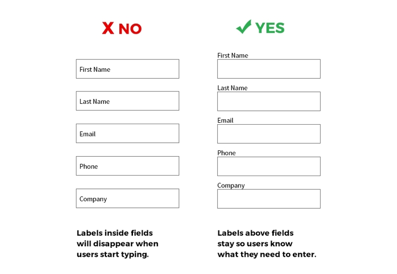
5. Add Form Labels and Indicate Mandatory Fields by More Than Color. Form frustration can easily cause any user to find an alternative site. Make the forms easy to complete by avoiding placeholder text and adding a permanent, clear label. Placeholders such as shown on the left in this example will disappear as the user is typing.

The user might have to delete all their work just to remember what the field was prompting them to enter. A developer can add clear labels to the fields and use an aria labelled by attribute to provide further labels to screen readers only.
In addition to setting form labels, if a field is mandatory, it should be distinguished by something other than color. A popular practice is to add an asterisk after the field name to indicate that it is a mandatory field. There should also be an instruction at the top of the form explaining the use of the asterisk.
Conclusion
Web Accessibility is easy to achieve and provides the best user experience for all your audience. These simple practices should become habit and can prevent a costly redesign or even avoid a lawsuit! In upcoming years, ADA standards will only solidify and become a larger part of the web design process. Starting these practices now will only help create a better web tomorrow.

